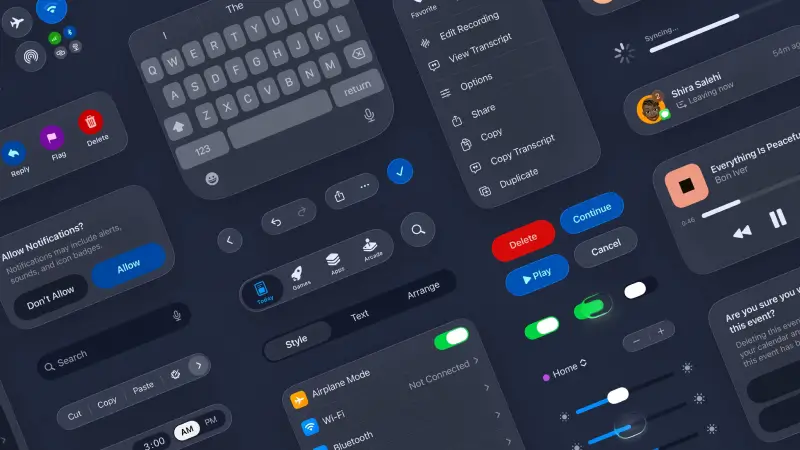
Apple has officially released comprehensive design kits for iOS 26 and iPadOS 26, providing developers with the essential tools needed to build apps that align with Apple's latest design standards. These kits support the major design platforms developers rely on daily: Figma, Sketch, and Adobe Creative Suite.
What's New in iOS 26 Design
iOS 26 introduces Liquid Glass, Apple's new design language that brings translucent, glass-like interface elements across all Apple platforms. More importantly for developers, this represents the first truly unified design system that works consistently across iOS, iPadOS, macOS, watchOS, and tvOS.
Official Design Kits: Complete Developer Resources
Apple has released design kits across all major design platforms, ensuring comprehensive tool support for development teams.
Figma Design Kit
- Release Date: July 17, 2025 (launched at WWDC25)
- Access: Available through Figma Community
- Download: Free with Apple Developer account
What's Included:
- Complete iOS 26 and iPadOS 26 UI component library
- All standard controls and views
- Design templates for common app layouts
- Text styles and typography specifications
- Colour styles with new system colours
- Material specifications for Liquid Glass elements
- Layout guides and spacing systems
- Interactive component states
Sketch Design Kit
- Release Date: June 9, 2025 (launched at WWDC25)
- Access: Direct download from Apple Design Resources
- Compatibility: Sketch App resource library integration
Kit Contents:
- Full Sketch symbol libraries
- iOS 26 and iPadOS 26 components
- Updated control sizes and layouts
- New corner radii specifications
- System colour palette
- Typography and text styles
- App icon templates
- Layout templates
Adobe Creative Suite Support
- Release Date: June 9, 2025
- Supported Tools: Photoshop and Illustrator
- Focus: App icon creation and visual assets
- Integration: Adobe Creative Cloud marketplace
Adobe Resources Include:
- App icon templates for all iOS 26 requirements
- Icon Composer compatibility files
- Multi-mode support (light, dark, tinted, transparent)
- Vector-based design elements
- Colour specifications and gradients
Design Kit Components and Features
Core UI Elements
Each design kit provides comprehensive coverage of iOS 26 interface elements:
Navigation Components
- Updated tab bars with dynamic behaviour
- New sidebar designs with content refraction
- Navigation bars with Liquid Glass styling
- Breadcrumb and segmented controls
Interactive Elements
- Buttons with new corner radii and materials
- Form controls and input fields
- Switches, sliders, and progress indicators
- Alert dialogs and action sheets
Content Presentation
- Table views and collection view layouts
- Card-based designs
- List styles and separators
- Content containers and backgrounds
App Icon Resources
Special attention has been given to app icon creation:
Icon Composer Integration
- New Apple tool for creating iOS 26 compatible icons
- Support for multiple appearance modes
- Automated optimisation for different contexts
- Preview functionality across all Apple platforms
Template Specifications
- Complete size variations (from 16x16 to 1024x1024)
- Light and dark mode variations
- Tinted mode support for widgets and shortcuts
- Fully transparent mode for special contexts
Technical Implementation Details
Framework Compatibility
- Automatic Updates: Apps using standard UIKit components receive automatic styling updates when compiled with Xcode 26
- Custom Components: Manual implementation required using design kit specifications
- Backwards Compatibility: Existing apps continue to function without forced updates
Cross-Platform Consistency
The design kits enable consistent experiences across:
- iPhone (iOS 26)
- iPad (iPadOS 26)
- Mac (macOS Tahoe 26)
- Apple Watch (watchOS 26)
- Apple TV (tvOS 26)
File Organisation
- Component libraries organised by function
- Nested symbols for easy customisation
- Consistent naming conventions across platforms
- Version control compatibility
What This Means for Development Teams
The release of comprehensive design kits across major platforms signals Apple's commitment to supporting developer workflows. Teams can now:
- Standardise Design Process: Use official Apple resources for consistent results
- Reduce Design Time: Leverage pre-built components instead of creating from scratch
- Ensure Approval Success: Design with official specifications reduces App Store rejection risk
- Maintain Cross-Platform Consistency: Single design system works across all Apple devices
The design kits are available for immediate download and use, providing development teams with everything needed to start creating iOS 26-ready applications today. If you'd like some support implementing these new designs into your application, you can reach us here.